I presented my paper 'Multi-level analysis strategy to make sense of concept maps' at the sixth international conference on concept mapping in Santos (Brazil).
You find find more resources about concept maps here.
Showing posts with label Mapping. Show all posts
Showing posts with label Mapping. Show all posts
Monday, June 29, 2015


Thursday, February 27, 2014
Inaccuracies in scientific illustrations
Michael Stevens provides a brief overview of some inaccuracies found in common science illustrations (including several historic ones).
Monday, October 14, 2013
Animated maps of US Civil War battles
 |
| Animated US Civil War maps |
Thursday, September 13, 2012
A geographical map of physics from 1939
This map from 1939 depicts physics as a geographical map with different areas (e.g. astronomy, electricity, heat, magnetism, etc.) and scientists as towns (e.g. Galileo, Newton, Leibniz, etc.).
[Source: http://www.ritholtz.com/blog/2012/09/1939-map-of-physics/]
 |
| Map of Physics [Click to enlarge] |
Thursday, June 30, 2011

Saturday, May 7, 2011
Map of Science History
This map, inspired by subway maps, shows leading scientist arranged by discipline.

www.crispian.net/CrispiansScienceMap.html
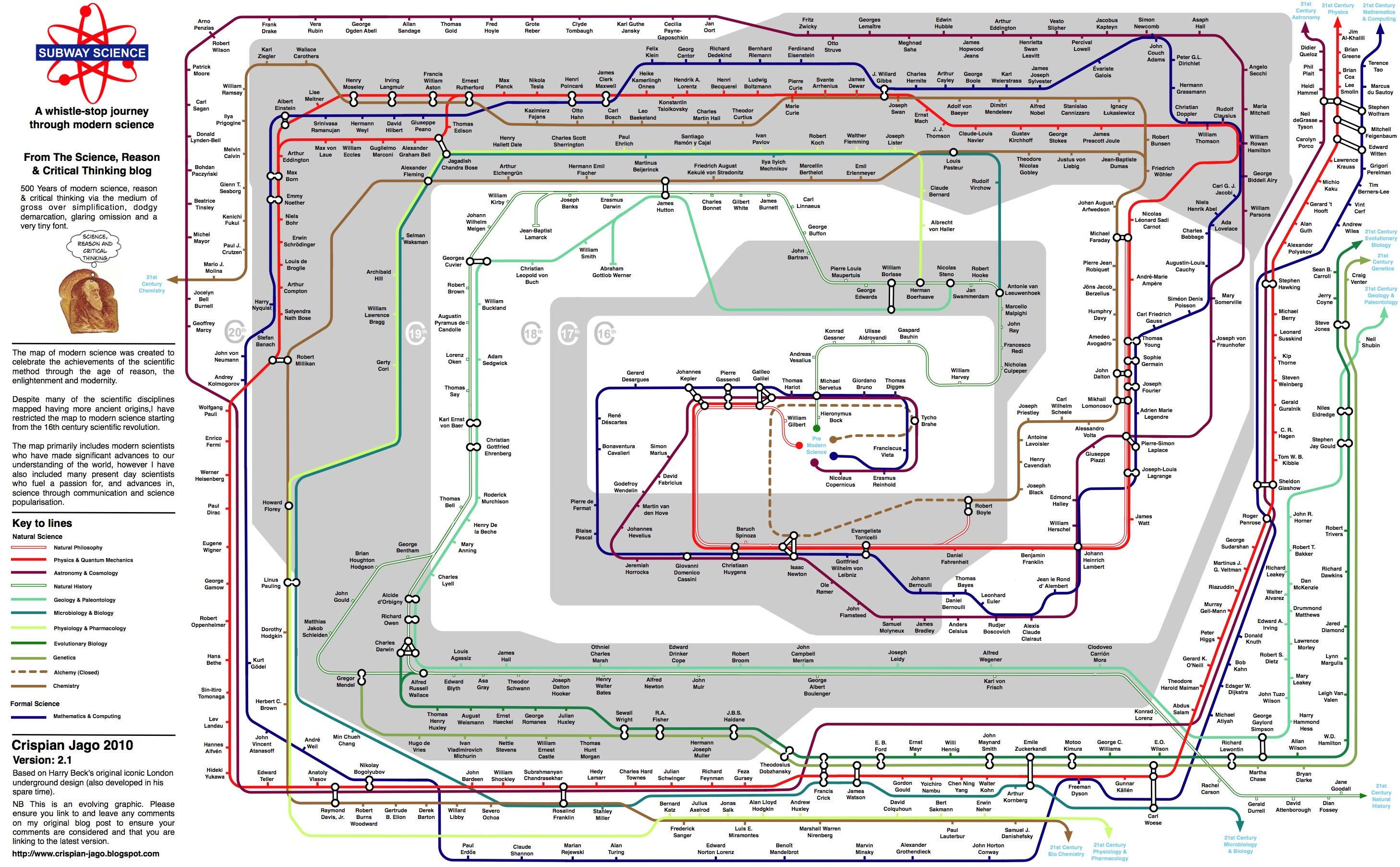
www.crispian.net/CrispiansScienceMap.html
Friday, April 29, 2011
Map of Monarchies around the World
It's the 21st century, but a number of countries are still monarchies. This interactive map by NPR shows the different countries and forms of monarchies around the world. [Click on the link below to see the interactive version].

Tuesday, April 19, 2011
World map of natural resources by country
This world map, created by mint.com, shows which countries have the most of different natural ressources. (Click on image to enlarge).

mint-world-resources-map-r2.gif (1450×1450)

mint-world-resources-map-r2.gif (1450×1450)
Tuesday, March 8, 2011
Why some countries drive on the right or the left side
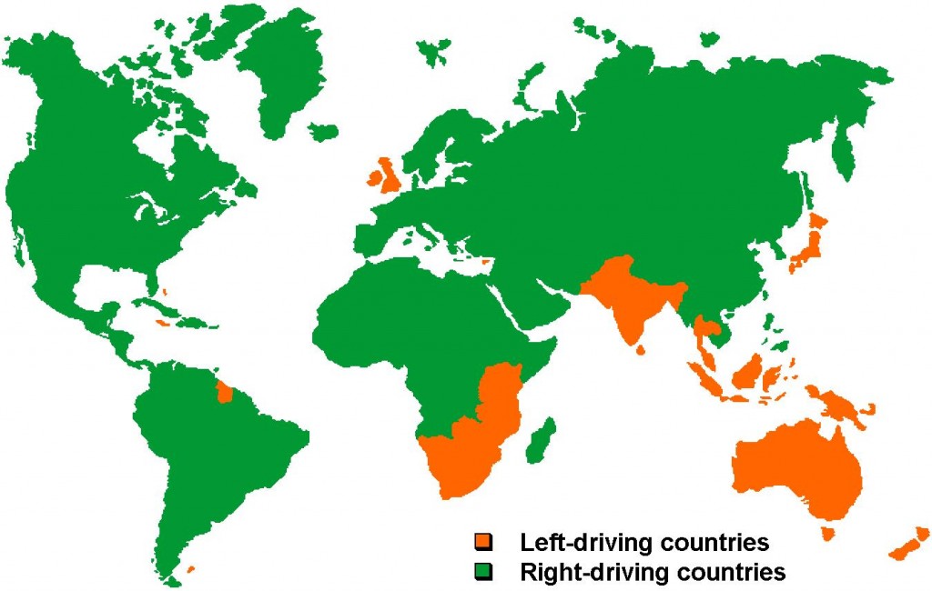
You can find some answers in this interesting essay on Why Some Countries Drive on the Right and Some Countries Drive on the Left
Thursday, March 3, 2011
Friday, February 18, 2011
Map of the Fantasy Worlds

Cartoonist Dan Meth has completed what he regards as the complete map of the Fantasy Universe. I wonder how Dan Meth decided that Wonderland shares borders with Middle earth.
Found here: Map of the Fantasy World | Geekosystem
Found here: Map of the Fantasy World | Geekosystem
Thursday, February 10, 2011
New York subway system as music instrument

See it here: MTA.ME
Sunday, February 6, 2011
Meaning of country names

Unfortunately, the map does not include references for further information.
etymology-map.jpeg (4500×2234)
Sunday, January 23, 2011
Map of the most common family names in the US
Geographers at University College London used phone directories to find the predominant surnames in each state. They created a map of the US showing which family name is most prominent in each area. America is a nation of Smiths, Johnsons, and Sullivans—but also of Garcias and Nguyens.
Click here to enlarge the map.
Click here to enlarge the map.

Sunday, November 14, 2010
Animated Map showing changing empires in Europe
This video shows an animated map of 1000 years of European history.
Tuesday, October 12, 2010
Infograph: The true size of Africa
Most people struggle to accurately describe the size of Africa. This infograph illustrates how Africa compares to different countries.


Subscribe to:
Posts (Atom)